After choosing an event for analysis, see the light curves.
It is useful to plot the correlation instead of the flux density.
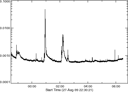
The method is as follows (Fig 1).
IDL> norh_rd_tcx,'1999-8-28',index,data ![]() CR
CR![]()
IDL> utplot,index,data,/ylog ![]() CR
CR![]()
Definition of 'correlation' is "averaged values of correlation of
antenna pairs (after removing short base-line pairs) of NoRH".
Correlation increases as a strong microwave signal comes
due to e.g. a flare. So it is used instead of the real light curve
(plot of flux density). For 17 GHz plot, 1 % of correlation corresponds
to 30 SFU flux density. It is used because
much computation resource is necessary for image synthesis
that is the only method to obtain flux density
at each time (see section 4.5.6).
And correlation has an advantage that it is almost
not affected by the weather condition. However,
it does not increase when the flux is so strong because
it has an upper limit of unity.